
Digitalised product information
Interactive Label
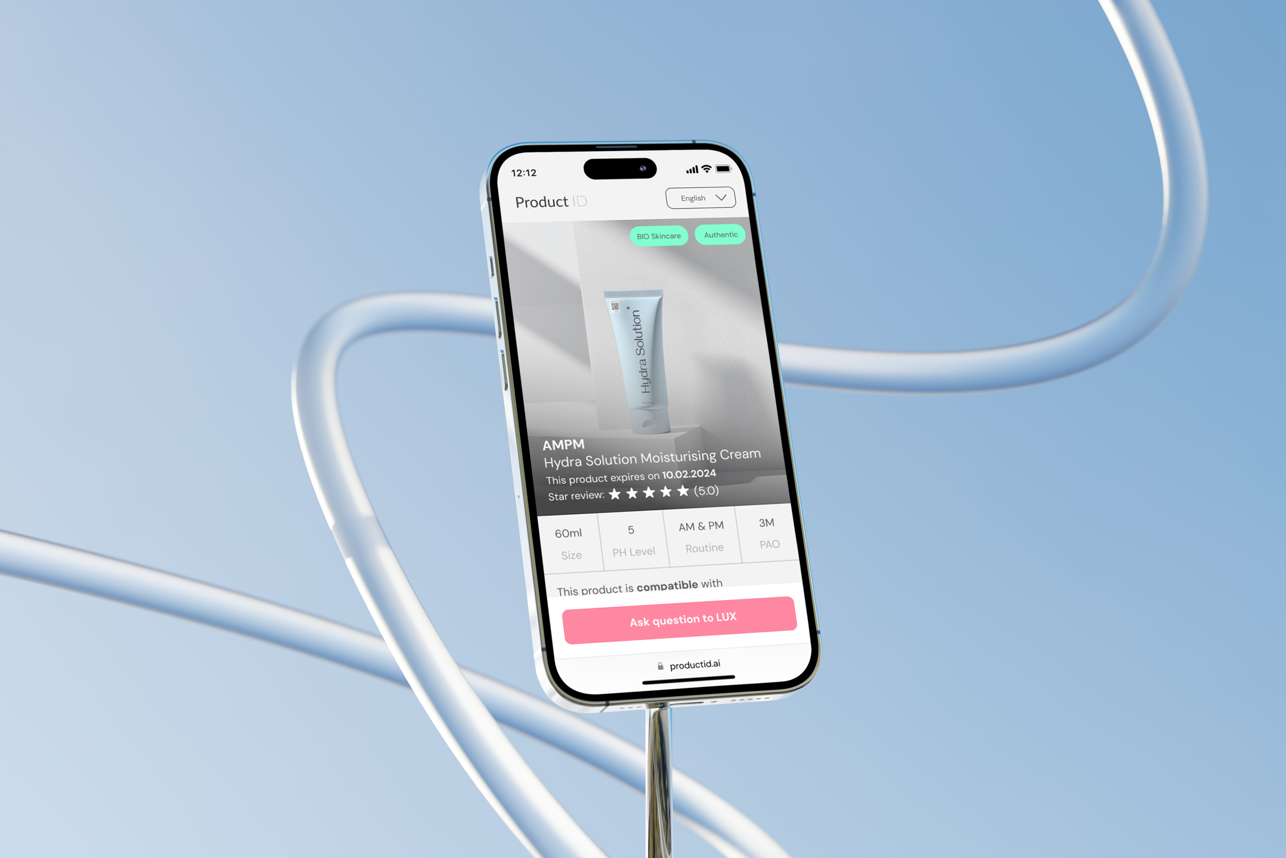
A mobile based web app accessible for users after user scans the Product ID QR code placed on the skincare product. Users are then available to see digitalised product information in the palm of their hands.
Roles & Responsibilities
Design system optimisation, UX solutions, Interface Design
Programs Used
Adobe XD, Lottie, Photoshop, Illustrator
Background Information
What is Product ID?
Product ID Overview: Product ID is a SaaS solution designed to create a seamless connection between skincare brands and users. It breaks down into smaller services, all working together to deliver meaningful value to both brands and consumers.
QR Code Integration: The service revolves around a single QR code scan. With one scan, users can access all digitalized product information through the interactive label, providing convenience and transparency.
Brand Dashboard: Through the Product ID dashboard, brands can generate batches of QR codes while inserting verified product information. Additionally, they can access detailed analytics on product usage, user engagement, and the types of information users are seeking.
Problem Solving
Interactive Label as a Communication Tool: The interactive label serves as a central point of interaction between brands and users, facilitating communication about the product. While users can access valuable information about the product they’ve purchased, brands gain insights into how users interact with the product, including demographics, user queries, and more.
Product Authenticity: Users can also verify the authenticity of the products they’ve purchased, addressing a significant issue in the skincare industry—counterfeit products. Many users are unaware of this issue, and the interactive label provides a means to ensure product authenticity.
Project Involvement and Adjustments: I joined the project after the initial design draft, and during the process, several issues arose. I identified key areas for improvement and implemented adjustments to enhance the overall user experience and ensure the success of the project.
Interactive label not interacting
Reason for failure:

Design Probelm
Small Text & Weak Hierarchy: The text is too small, resulting in a lack of clear hierarchy, making it difficult for users to navigate or prioritize information.
Important Text Appearing Like a Button: Certain key text elements are styled in a way that makes them look like buttons, causing confusion.
Unclear & Misleading UX Copywriting: The text is not easily understandable, leading to a poor user experience due to ambiguous or confusing messaging.
Insufficient Clickable Space on Buttons: The buttons lack adequate space for users to click, and their design doesn't visually convey that they are clickable elements.
Icons Lack Visibility: Icons blend into the design due to low contrast and fail to stand out in the visual hierarchy, making them less effective.
Workflow problem
Inconsistent Design System: The design system lacked cohesion, with components not aligned to the updated design. Each time a designer worked on the project, new designs were created without a clear understanding of priority information or the correct order of components, leading to inconsistencies.
Version Control Issues: As the team tested new designs, it became difficult to identify the most current version due to disorganized workflow and lack of clear version management.
Solving the problem
Rethink, Rebuild, Redesign
To effectively address the challenges, I took a step back to simplify the process by rethinking, redefining, and rebuilding the entire design workflow.
First, I rethought the approach by analyzing the root causes of the inconsistencies and inefficiencies in the design system. This involved reviewing how components were being developed, prioritized, and shared among the team, and identifying gaps in communication and documentation.
Next, I redefined the design system to create a more structured and cohesive framework. I aligned the components with the updated design guidelines, ensuring that every designer was working from a unified system. This redefinition included documenting the proper use of components, establishing clear design priorities, and creating a centralized source for all design elements, eliminating confusion.
Finally, I rebuilt the process by implementing a streamlined workflow that prioritized better version control, clear communication, and collaborative teamwork. This ensured that every new design iteration was tracked, versioned, and aligned with the overall design goals. I also introduced better tools for managing design updates and created regular check-ins with the team to maintain consistency and focus.
Through this approach, I ensured a more efficient and organized design process, which allowed the team to work more cohesively and produce higher quality results.
Adjustment for success:

UI redesign
Revamped Interface Design: The interface was redesigned with updated components, featuring more user-friendly colors, fonts, and spacing.
Improved Usability: Spacing adjustments were made to enhance usability, ensuring buttons and interactive elements are more comfortable for users to navigate.
Optimized CTA Placement: Call-to-action (CTA) buttons and key user actions were strategically placed in more accessible areas to improve the overall user experience.

Closer to usability
Internal Confusion: There was initial confusion among designers about whether the interactive label would be built as an app or a web-based service.
Final Decision: It was eventually decided that the service would be web-based, requiring adjustments in design.
CTA and Design Modifications: The placement of call-to-action (CTA) buttons and overall design had to be modified to accommodate the unique behavior of the search bar.
Search Bar Animation: The search bar triggered different animations as users scrolled up and down, necessitating design adjustments.
UX copywriting modification
Copywriting Adjustments: The main information copywriting was modified. While the previous copy was straightforward, it lacked engagement, causing users to feel as though they already knew everything about the product.
Psychological Strategy: By leveraging user psychology, I revised the copy to create curiosity and introduce a moment of hesitation, encouraging users to explore and check the product information more thoroughly.
Interface Design and Design System
Redesign of Existing Components: During the process, I redesigned the existing component sets to align with the new design direction.
Flexible Design Approach: I adopted a design approach inspired by LEGO blocks, where the shape and content remain consistent, but the arrangement can be customized. This flexibility allows the design to evolve and adapt, enabling the creation of new layouts from pre-existing components.
Customization for Brand Dashboard: The flexibility of this design approach was crucial, particularly as a new functionality was being developed in the brand dashboard to allow customization of the order and arrangement of the interactive label blocks.

Strong design system- Expand!
Expansion of Content and Components: Thanks to the successful design, the interactive label was able to expand beyond individual products to include brand-wide content and component sets.
Brand-Centric Information: The updated design allows brands to showcase key information, including their vision, top-selling products, certifications, and their approach to sustainability.
Outcomes
Expansion of Business Model: After the design adjustments, the business recognized the potential of the interactive label across various industries. As a result, the business model began expanding to target sectors such as medicine, supplements, fashion, and electronics.
Industry Collaboration: For the skincare industry, we had the opportunity to engage with prominent brands like Sephora and other skincare companies to develop their interactive labels.
Future Considerations: Although the project was paused, I have been considering further expanding the design for eCommerce platforms. This expansion could offer significant benefits, directly impacting brands’ sales by improving product engagement and conversion rates.